Beta
Thermal Network Studio
Could this neighbourhood share its heat?
- Draw any US neighbourhood on a real map
- Hourly heating and cooling for every building, calibrated to national stock
- Bore fields, heat pumps, towers, rivers and waste heat on one loop
- Scored on efficiency and carbon against the buildings as they are
- Challenges, a shareable award, project files and share links
- Runs in the browser — no account, no upload
A thermal energy network is one loop of water at close to ground temperature, run under a street. Every building on it has its own heat pump. A building that is cooling puts heat into the loop, and a building that is heating takes it out — so an office rejecting heat on a winter afternoon warms the homes across the road, and the ground, a river or a sewer carries the rest.
Whether that works for a particular place depends on things that can be seen from a map: how dense the buildings are, how much of the year they heat against how much they cool, and what is nearby to lean on. Thermal Network Studio puts those in front of you for the neighbourhood you actually care about.
Use to explore how a shared thermal network could work in a neighborhood. Uses first-principle physics and publicly accessible building data. Use it to convey an idea, learn about thermal energy networks and your neighborhood. Not for a full feasibility study, to learn more find an expert and start a dialog.
Draw a neighbourhood, and every building arrives with a load
Draw a boundary anywhere in the US. The buildings come from OpenStreetMap, filled where it is thin from federal structure inventories, and each is classified — use, storeys, age — with everything inferred marked as a guess that you can correct.
Each building then gets a full year of hourly heating, cooling and hot water from a simple thermal model, calibrated so that its annual totals match the national building-stock simulations for its type and climate zone. The annual figures are calibrated; the hourly shape is the model’s own, and the tool says so.
Build the loop, then run the year
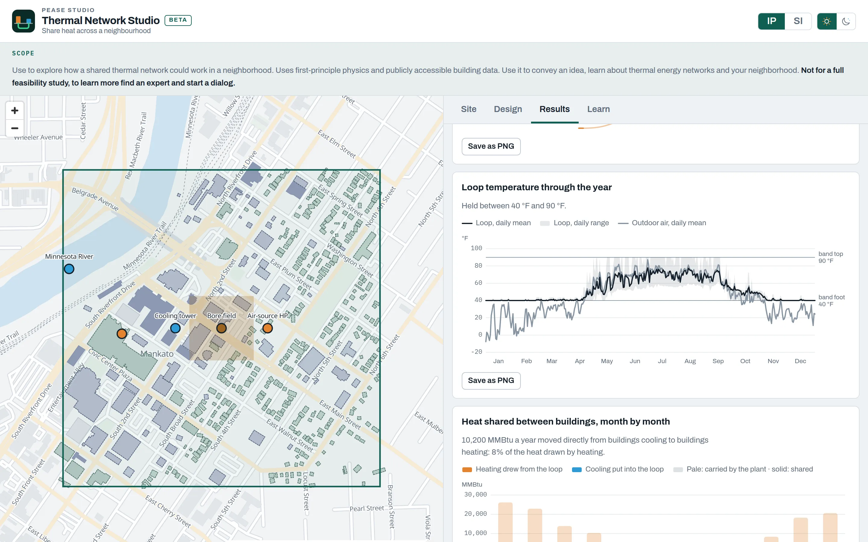
Connect what is nearby — a river, a supermarket’s refrigeration, a data centre — and add plant: bore fields sized against the open ground that can actually hold them, reversible air-source heat pumps, cooling towers. Or ask for a starting design and improve on it; it is deliberately unoptimised.
Every change re-runs all 8,760 hours in the browser. What the design cannot carry goes to electric backup and is counted, never hidden. A bore field is followed for 25 years, because a field that draws more heat than it gets back cools a little every year.
Scored against today, not against a promise
The result is a score for efficiency and carbon against the same buildings as they stand today, using hourly grid emissions for the region. A score is not a saving. The tool also shows what a network would do to winter and summer electric peaks compared with electrifying each building on its own — the number a utility would ask about first.
Why it is a beta
The physics is complete and tested; the tool is new. Building data is only as good as OpenStreetMap is in your neighbourhood, and some places are thin. If something reads wrong, the source is open and an email is welcome.